Why you cannot spot the difference
Two photos, one small change, and you stare for ages before you find it. The reason is that your visual system does not keep a copy of the picture. It keeps a summary of what things mean, and a change to a meaningful part of the scene is caught much faster than a change to a meaningless one.
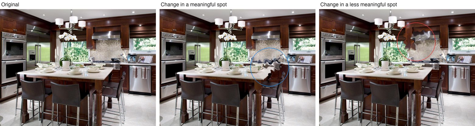
Everyone has done a spot-the-difference puzzle. Two nearly identical pictures sit side by side, you are told there are five differences, and you find three of them in a few seconds and the last two only after an embarrassingly long search. The puzzle works because of a quirk of vision that psychologists call change blindness. If the change happens while you are looking straight at it, you see it at once, because motion grabs the eye. Take the motion away, by putting the two pictures apart, or by inserting a blank screen between them, or by making the change during a blink or an eye movement, and even a large change can go unnoticed for a surprisingly long time.1
Change blindness is not just a party trick. It is a window into what the visual system keeps in memory from one moment to the next. If you noticed every change, we would conclude that you store something like a photograph and compare it against the next one. You do not notice every change, so whatever is stored must be sparser than a photograph. The interesting question is what survives. Which parts of a scene does the visual system bother to hold on to?
Meaning, measured
The long-standing suspicion is that meaning survives. Studies going back decades found that changes to the "interesting" parts of a scene, or to objects that do not belong in it, are caught faster.2 The trouble with that evidence is the word "interesting." Someone had to decide which regions were interesting, and that judgment could smuggle in all sorts of things: contrast, color, edges, how central the region is, or simply how big the object is. To say that meaning drives change detection, you need a way to measure meaning that is separate from all of that.
That is what meaning maps provide. John Henderson and Taylor Hayes developed them in 2017.3 A photograph is cut into a few hundred overlapping circular patches, at two sizes. Each patch is shown on its own, out of context, to many people, who rate how meaningful it is on a six-point scale. Average the ratings, smooth them, and you get a heat map of where the meaning is in the scene. The map is simply the aggregated response of many people about all the places in the image they found meaningful.
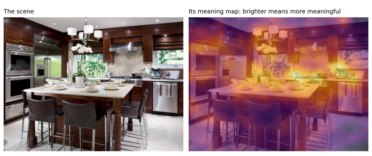
The natural control comparison is a saliency map, which is computed from the image itself, with no people involved, and marks where the contrast, color, and edges are strongest. Meaning and saliency share a good deal of information, since meaningful objects often have strong edges, so a region that people find meaningful will often be salient as well. To ask whether meaning does anything on its own, the study had to hold saliency constant and vary meaning, which is what the design below does.
The experiment
Alan Lu and I designed and ran this study together in John Henderson's lab at UC Davis. We built it around a classic flicker task. A photograph of a scene flashes for about a quarter of a second, a grey screen for a fraction of that, then the photograph again with one region altered, then grey, and so on, back and forth. There is no motion to give the change away. Your job is to press the space bar the moment you spot it, then click on where it was.
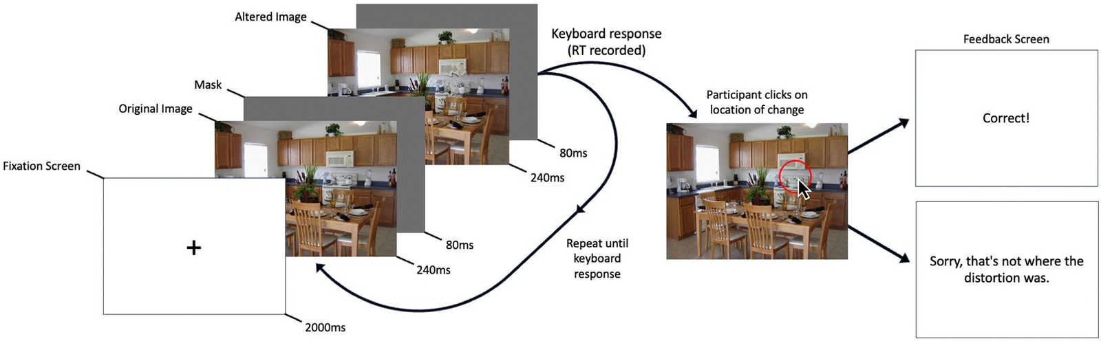
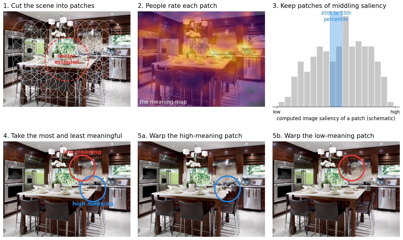
Three design choices did the work.
- Two changes per scene, matched for saliency. For each of 196 photographs we picked two patches: the most meaningful one and the least meaningful one, according to the meaning map. But we chose them only from patches whose saliency fell in a narrow middle band, so the two locations looked equally "interesting" to a camera, and differed only in how meaningful people found them.
- A change that has no low-level signature. Instead of adding or removing an object, we warped the patch with a diffeomorphic transformation, a smooth distortion that keeps the colors, brightness, and edge statistics of the original but scrambles what it depicts. Earlier work had shown that meaning maps notice this kind of distortion and saliency models do not.4
- Center bias, measured and controlled. People look at the middle of pictures first, so a change near the center is found faster whatever it means. We recorded how far each change was from the center and took that out statistically.
Nearly two hundred people did the task online. Changes in the meaningful patches were found faster, by about 600 milliseconds in the raw averages, and by a little over 300 milliseconds once the center bias was taken out. That is a large effect for a task where the two locations were, to a camera, indistinguishable.
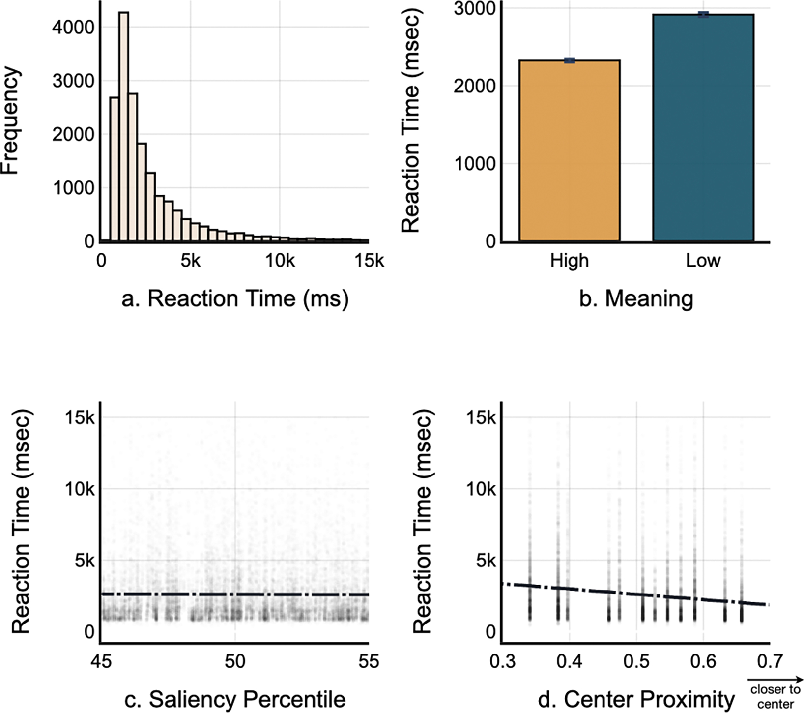
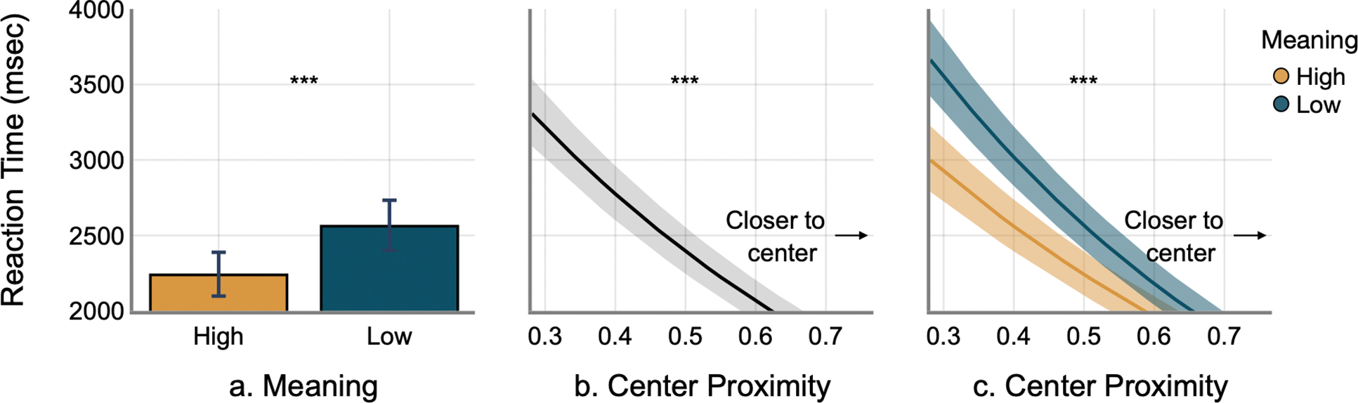
One detail in the last panel is worth a pause. The meaning advantage was largest for changes far from the center. Near the middle, where attention lands anyway, meaning hardly mattered. Out at the edges, where the visual system has to choose what to bother with, it leaned on meaning to decide.
More details about the first experiment
Of 240 UC Davis undergraduates, 196 were kept after excluding anyone below 80% detection accuracy or with incomplete data. The 196 scenes came from Henderson & Hayes (2018), half indoor and half outdoor, with no people or animals, shown at 700 by 525 pixels in a browser via jsPsych. Images alternated for 240 ms each with an 80 ms grey mask, for up to 15 s. Candidate patches were 205 pixels across, excluded from the center and edges, and filtered to the 45th to 55th saliency percentiles before picking the highest- and lowest-meaning patch. Distortions used the default diffeomorphic parameters and were blended at the edges. Reaction times were modeled with a gamma mixed model on correct trials with scene and participant intercepts. Mean times were 2,325 ms for high-meaning and 2,915 ms for low-meaning changes; the model gave a meaning effect of b = 0.13, a center proximity effect of b = −1.33, and an interaction of b = −0.30, all p < .001, with an adjusted advantage of 323 ms.
Try it yourself
Below is the task itself, trimmed to six pictures. In three of them the change sits in a more meaningful region of the scene and in three a less meaningful one, always chosen among regions of matched saliency, and the feedback tells you which was which. Most people find the more meaningful ones noticeably faster.
Turning the world upside down
A skeptic could still say that "meaning" is just some unmeasured low-level feature that the raters were responding to. So the second experiment ran the whole thing again with every photograph upside down. Inversion is a standard trick in this line of work: it changes nothing about the pixels, the contrast, or the edges, but it makes scenes much harder to understand. If the meaning advantage comes from understanding, inversion should shrink it. If it comes from something in the pixels, inversion should leave it alone.
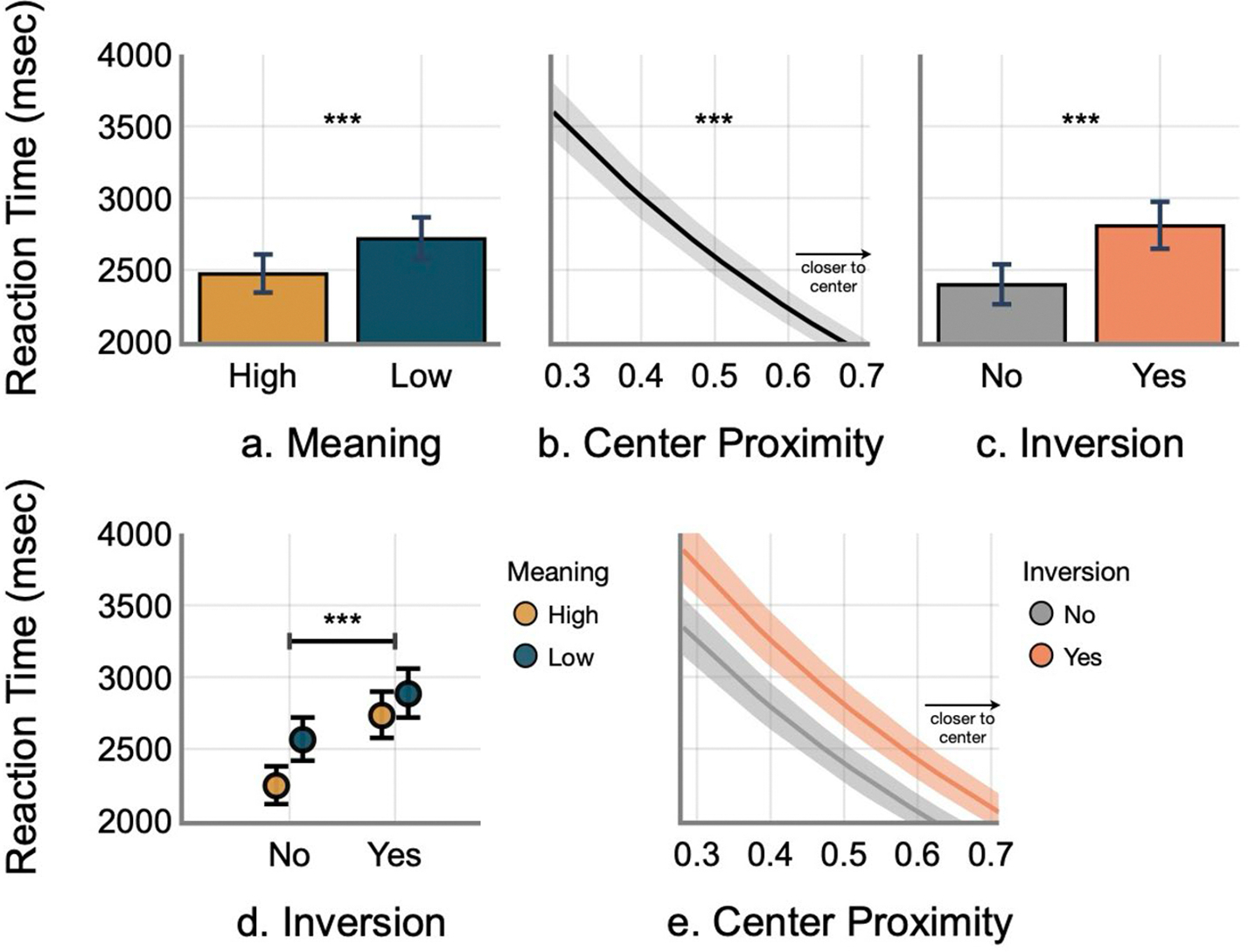
It shrank. With inverted scenes everyone was slower overall, by around 400 milliseconds, which is itself a sign that understanding the scene helps you find changes in it. And the meaning advantage dropped from about 320 milliseconds to about 140. The part of the effect that inversion removed is the part that depended on knowing what you were looking at.
More details about the second experiment
A fresh 240 undergraduates took part, with 189 kept after the same exclusions. Everything else matched the first experiment except that the images were rotated by 180 degrees. Mean times were 2,768 ms for high-meaning and 3,205 ms for low-meaning changes, about 400 ms slower than upright. The adjusted meaning advantage was about 140 ms. In a combined model of both experiments, inversion slowed detection (b = 0.20) and, critically, interacted with meaning (b = −0.08, p < .001), with no interaction between inversion and center proximity. Earlier work had reported the inversion cost alone.5
What this says about seeing
Put the two experiments together and the answer to the opening question is fairly clear. What the visual system holds from one glance to the next is not a copy of the picture. It is weighted by meaning. Change something in a part of the scene that people find meaningful and the change is noticed sooner, even when that part is no more eye-catching than any other, even when the change itself has no low-level fingerprint, and more so the farther the change sits from the center of the picture. Take away the ability to understand the scene, and much of that advantage goes with it.
There is a link to attention here. The same meaning maps were originally built to predict where people look when they view a scene, and they do that well. Now the same maps predict which changes people catch. That suggests attention and change detection are drawing on the same map of the world, and it fits with the long-standing finding that changes at attended locations are noticed and changes elsewhere are missed.
There is a puzzle left open. Meaning maps score patches of space, not objects. Whether the visual system really tracks meaning as a spatial density, or tracks objects and their meanings and the patches just inherit that, is something this design cannot separate, and it is a question for future studies.

Visual Cognition Lab, UC Davis

Center for Mind and Brain, UC Davis
Lu, Upadhyayula & Henderson (2025). Meaning maps predict reaction time in change detection. Visual Cognition, 33, 89–104. Paper · Free full text · Data · Try the task
This work in the research section: What drives change blindness in naturalistic scenes?
Figure credits. The opening picture, the meaning map illustration, and the design schematic use the demonstration scene from the experiment and were prepared by the author from the study materials. Figures 1, 2, 3, and 6 are reproduced from Lu, Upadhyayula & Henderson (2025), Visual Cognition, doi:10.1080/13506285.2025.2507946, via the author manuscript in PubMed Central. The headshots are from the UC Davis Visual Cognition Lab and Center for Mind and Brain pages.
-
Rensink, O'Regan & Clark (1997), To see or not to see: The need for attention to perceive changes in scenes, Psychological Science, doi:10.1111/j.1467-9280.1997.tb00427.x. Change blindness during eye movements and blinks came up in my film post as well. ↩
-
Hollingworth & Henderson (2000), Semantic informativeness mediates the detection of changes in natural scenes, Visual Cognition, doi:10.1080/135062800394775; Stirk & Underwood (2007), Low-level visual saliency does not predict change detection in natural scenes, Journal of Vision, doi:10.1167/7.10.3. ↩
-
Henderson & Hayes (2017), Meaning-based guidance of attention in scenes as revealed by meaning maps, Nature Human Behaviour, doi:10.1038/s41562-017-0208-0. ↩
-
Stojanoski & Cusack (2014), Time to wave good-bye to phase scrambling: Creating controlled scrambled images using diffeomorphic transformations, Journal of Vision, doi:10.1167/14.12.6; Hayes & Henderson (2022), Meaning maps detect the removal of local semantic scene content but deep saliency models do not, Attention, Perception & Psychophysics, doi:10.3758/s13414-021-02395-x. ↩
-
Shore & Klein (2000), The effects of scene inversion on change blindness, The Journal of General Psychology, doi:10.1080/00221300009598569. ↩